Work I’m Proud Of
Nike
Challenge: Democratize Nike Golf culture and disrupt it to engage a younger demographic, making the brand feel accessible while staying true to Nike’s core values.
Solution: We developed multiple creative approaches, including social-first campaigns, experiential activations, and digital-first storytelling, all designed to make Nike Golf feel fresh, playful, and relatable for a new audience.
Impact: The campaigns generated strong engagement across social platforms, increased younger audience participation, and positioned Nike Golf as approachable and relevant while reinforcing its premium image.
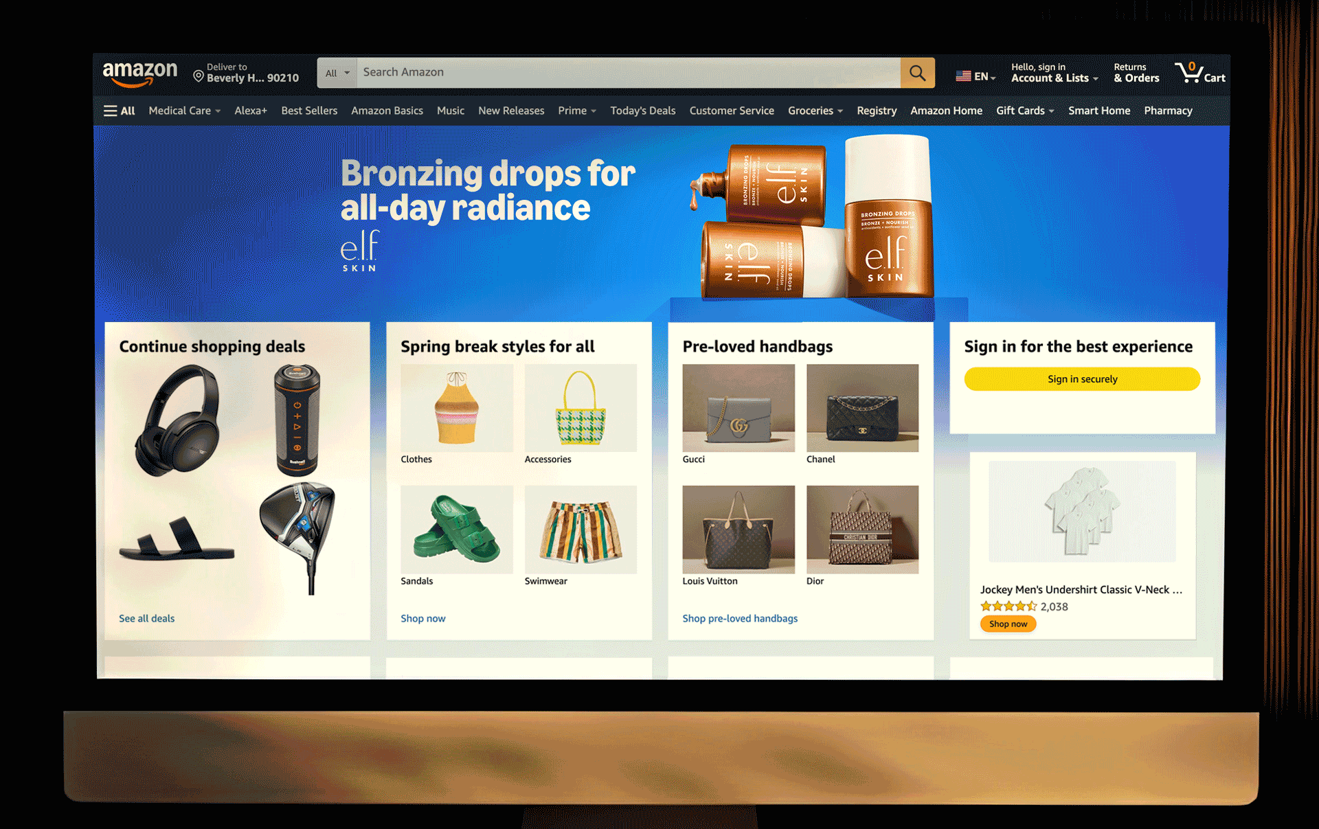
Amazon
Challenge: Amazon has a massive volume of brand assets and campaigns. Our goal was to continue each brand’s storytelling while maintaining Amazon’s consistent presence and tone.
Solution: We developed a streamlined asset management and review process, ensuring brand integrity while applying Amazon’s visual identity across digital, social, and email campaigns. This included building templates, maintaining master files, and coordinating approvals efficiently in Figma.
Impact: Brands’ campaigns stayed true to their own voice, while Amazon’s presence remained cohesive across platforms. The process improved turnaround times and minimized errors, keeping stakeholders happy and campaigns on schedule.
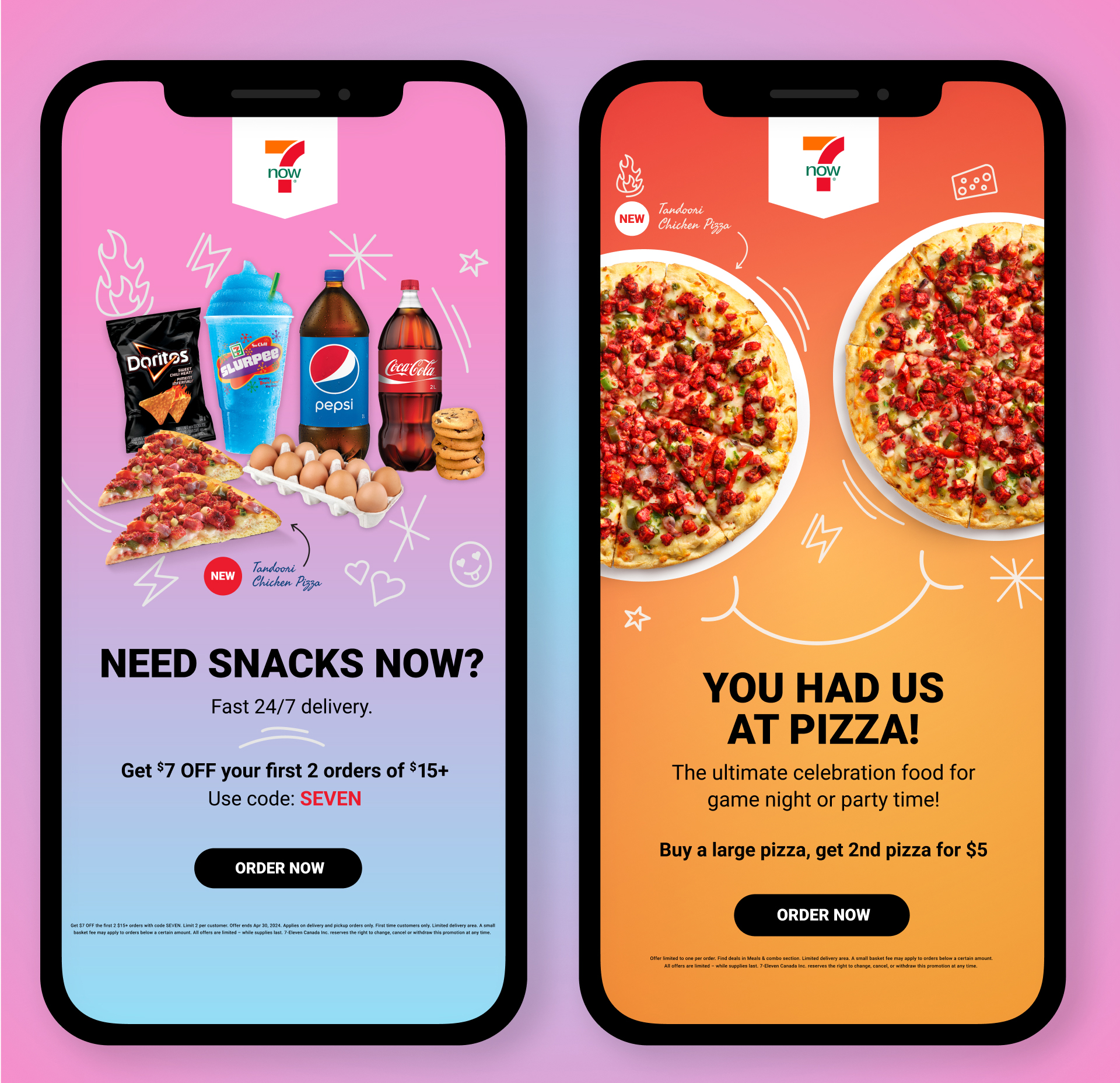
7-Eleven
Challenge: As a brand-new client, 7-Eleven needed to build trust with our team while effectively reaching a specific generation through social media and email platforms. The goal was to engage audiences in a way that felt fresh, exciting, and visually distinctive.
Solution: We developed targeted campaigns with tailored color palettes, dynamic visuals, and playful, engaging layouts. Each piece—from social posts to email assets—was designed to resonate with the audience while maintaining 7-Eleven’s recognizable identity.
Impact: Campaigns successfully captured the attention of the targeted demographic, increasing engagement across social and email channels. Our approach strengthened the client relationship and established a foundation for ongoing creative collaboration.
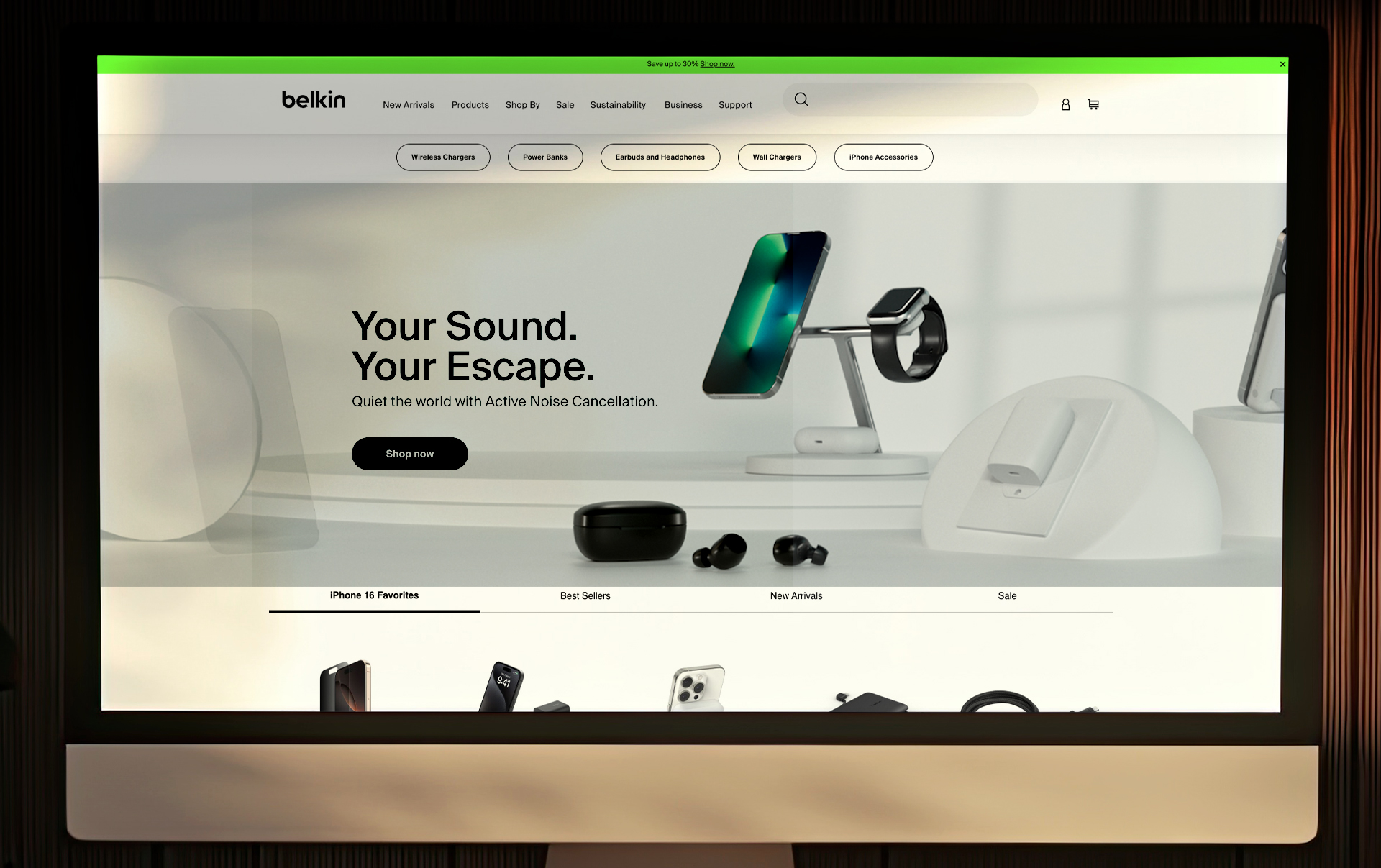
Belkin
Challenge: Belkin needed to showcase their products in authentic environments while clearly communicating their full ecosystem. The challenge was to use visual storytelling to make each product feel connected, purposeful, and true-to-life.
Solution: We created detailed 3D environments using Cinema 4D, carefully placing products to highlight their functionality and interaction. Lighting, color correction, and composition were meticulously applied to ensure realism and cohesion across all visuals.
Impact: The final assets effectively communicated Belkin’s product ecosystem, elevating brand perception and providing versatile visuals that could be used across campaigns. This approach enhanced the audience’s understanding of how Belkin products integrate seamlessly into daily life.
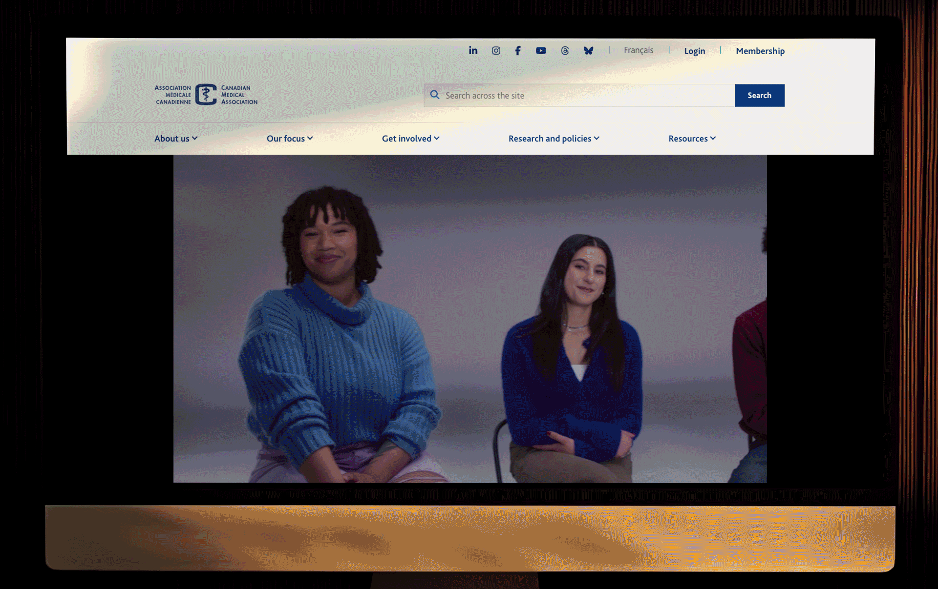
CMA
Challenge: The Canadian Medical Association (CMA) needed to bridge the gap between current doctors and Generation Z. Systemic issues like the family doctor shortage, administrative burdens, and generational differences in work-life expectations made it difficult to connect with younger audiences.
Solution: We developed a visual identity and campaign using vibrant, thoughtful visual cues that resonated with Gen Z while remaining respectful and professional for existing doctors. The visuals leveraged bold colors, dynamic layouts, and approachable graphics to communicate CMA’s mission effectively.
Impact: The campaign successfully engaged both audiences, positioning CMA as forward-thinking and approachable while maintaining trust with current doctors. The visuals increased awareness and understanding of CMA’s initiatives among younger audiences.
VISA
Challenge: VISA Fandemonium encompasses fan-focused promotions and events, from sports activations to pop culture experiences like the Toronto International Film Festival. The goal was to engage passionate fans while promoting unique products, including branded debit cards and school spirit initiatives.
Solution: We created campaign visuals and assets that captured the energy of the fans, highlighting key moments in sports and pop culture. The design emphasized excitement, interaction, and the connection between VISA and fan experiences, ensuring each activation felt immersive and authentic.
Impact: The campaign increased fan engagement across multiple channels, drove participation in VISA promotions, and reinforced VISA’s brand presence in sports and entertainment, successfully connecting with both existing and new audiences.

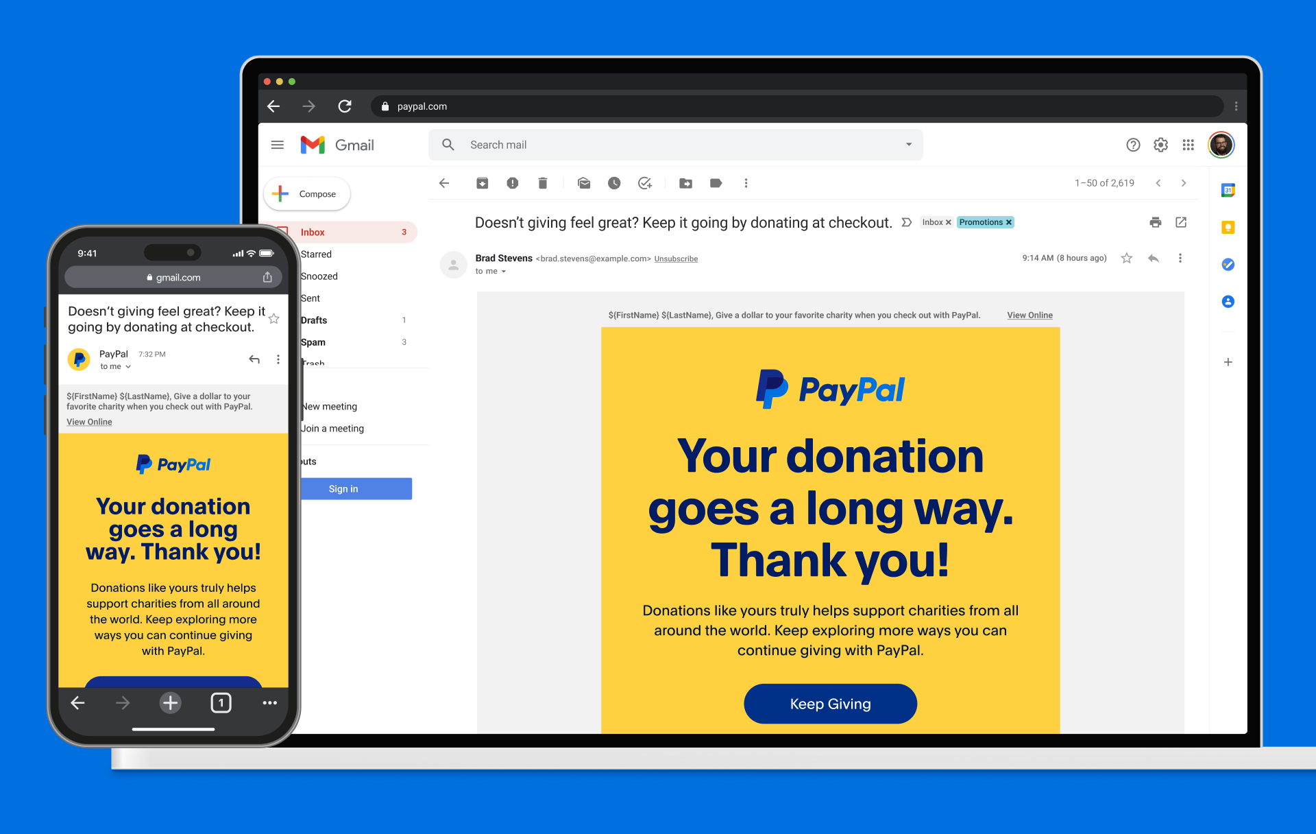
PayPal
Challenge: The main communication challenge for PayPal with Generation Z is adapting to their preference for mobile-first, highly visual, frictionless, and authentic experiences on social media platforms. This audience is less engaged with traditional payment methods and desktop interfaces.
Solution: We developed mobile-first campaign visuals and prototypes, focusing on seamless user experience, engaging content, and social-first communication strategies. Our approach ensured that PayPal’s messaging was authentic, visually compelling, and resonated with Gen Z behaviors and habits.
Impact: The campaigns improved engagement with younger audiences, increased interaction with PayPal social content, and strengthened brand affinity among mobile-first users, while keeping messaging consistent across channels.
Shure
Challenge: How do we showcase the revolutionary technology inside Shure products? The goal was to highlight all the intricate details and technical innovation within each device, communicating its value clearly and compellingly.
Solution: We used 3D software to create highly detailed visualizations of the internal components, crafting dynamic and interactive graphics that demonstrated the technology in a way that was both educational and visually engaging.
Impact: The project successfully conveyed Shure’s technological excellence, helping audiences understand the product’s sophistication while supporting marketing and product education goals.
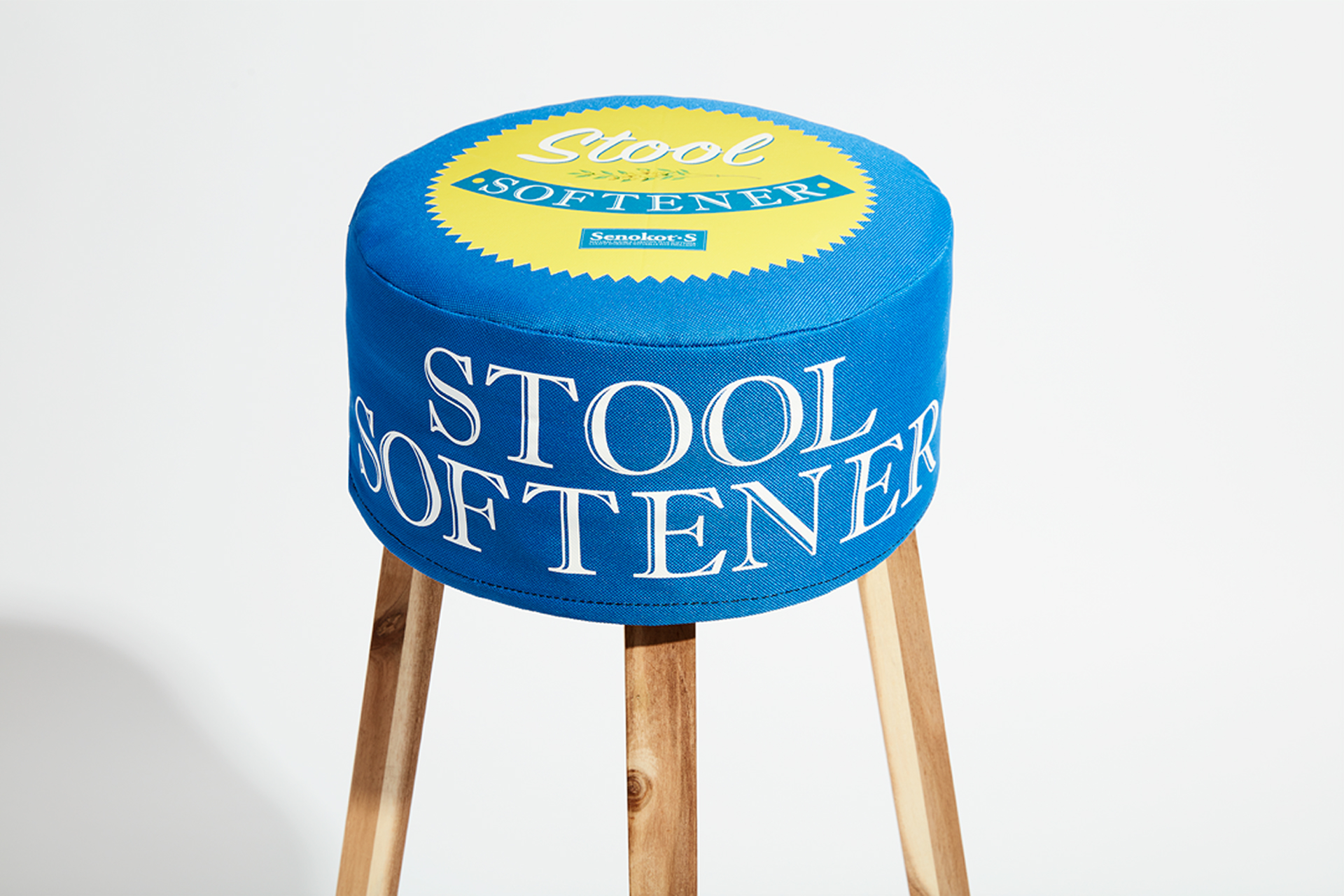
Senekot
Challenge: How do we showcase a product that’s both functional and playful—a stool softener—while integrating it naturally into social spaces like bars, stadiums, or trade shows?
Solution: We designed an experiential setup for trade shows that brought the product to life in a humorous and interactive way, while creating content that highlighted its relevance in everyday cultural settings. This included playful installations and photography that captured the product’s personality without feeling clinical.
Impact: The approach allowed audiences to engage with the product in memorable ways, creating social buzz and elevating brand awareness while maintaining a playful yet approachable tone.
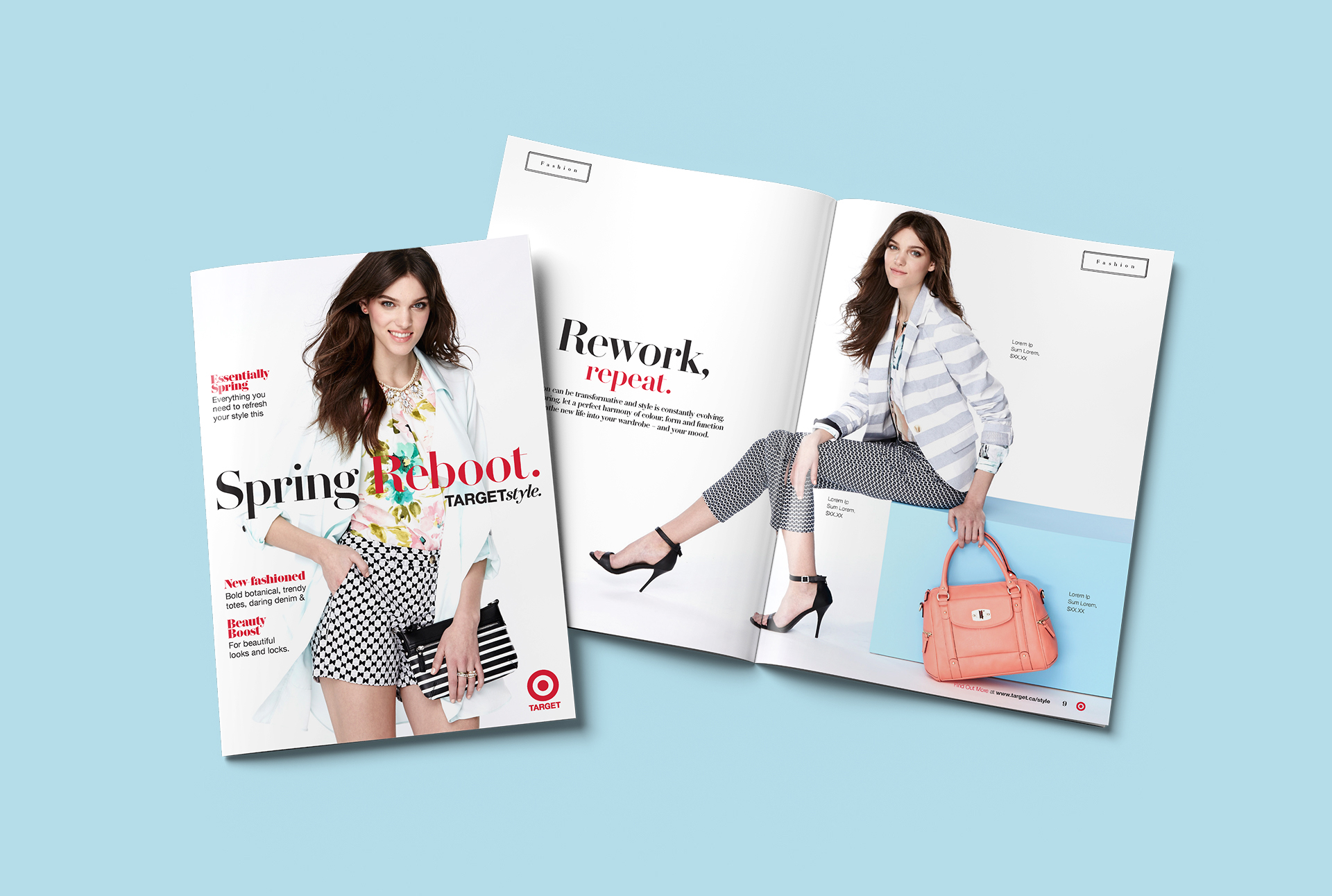
Target Canada
Challenge: How do we connect to a mass market while showcasing the depth and breadth of Target Canada’s fashion, home, holiday, and toy catalogs?
Solution: We produced comprehensive catalogs and micro-magazines, balancing editorial storytelling with visually appealing layouts for each product category. Photography, styling, and layout were coordinated to create cohesive narratives that resonated across multiple demographics and channels.
Impact: The project allowed Target Canada to present a unified brand experience while highlighting category-specific products, driving engagement and supporting sales initiatives during key holiday and seasonal periods.
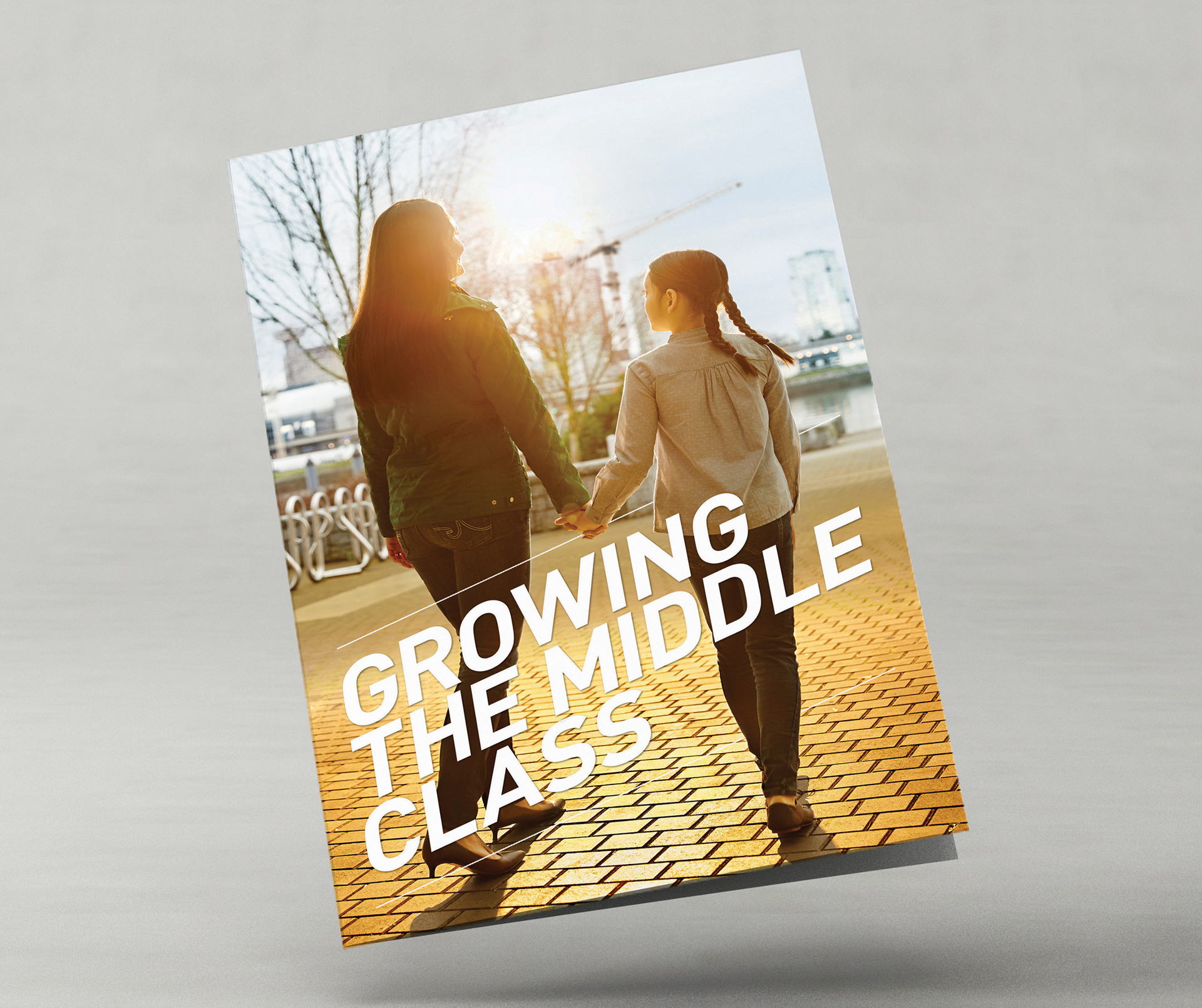
Department of Finance Canada
Challenge: How do we showcase the government’s efforts to grow the middle class?
Solution: We highlighted infrastructure, and community development projects, visually communicating initiatives aimed at rebuilding and supporting the middle class. Key visuals included federal projects, economic programs, and tangible outcomes that were accessible and engaging.
Impact: The campaign provided clear, visual storytelling that connected policy with real-world results, making government efforts tangible to a wider audience.
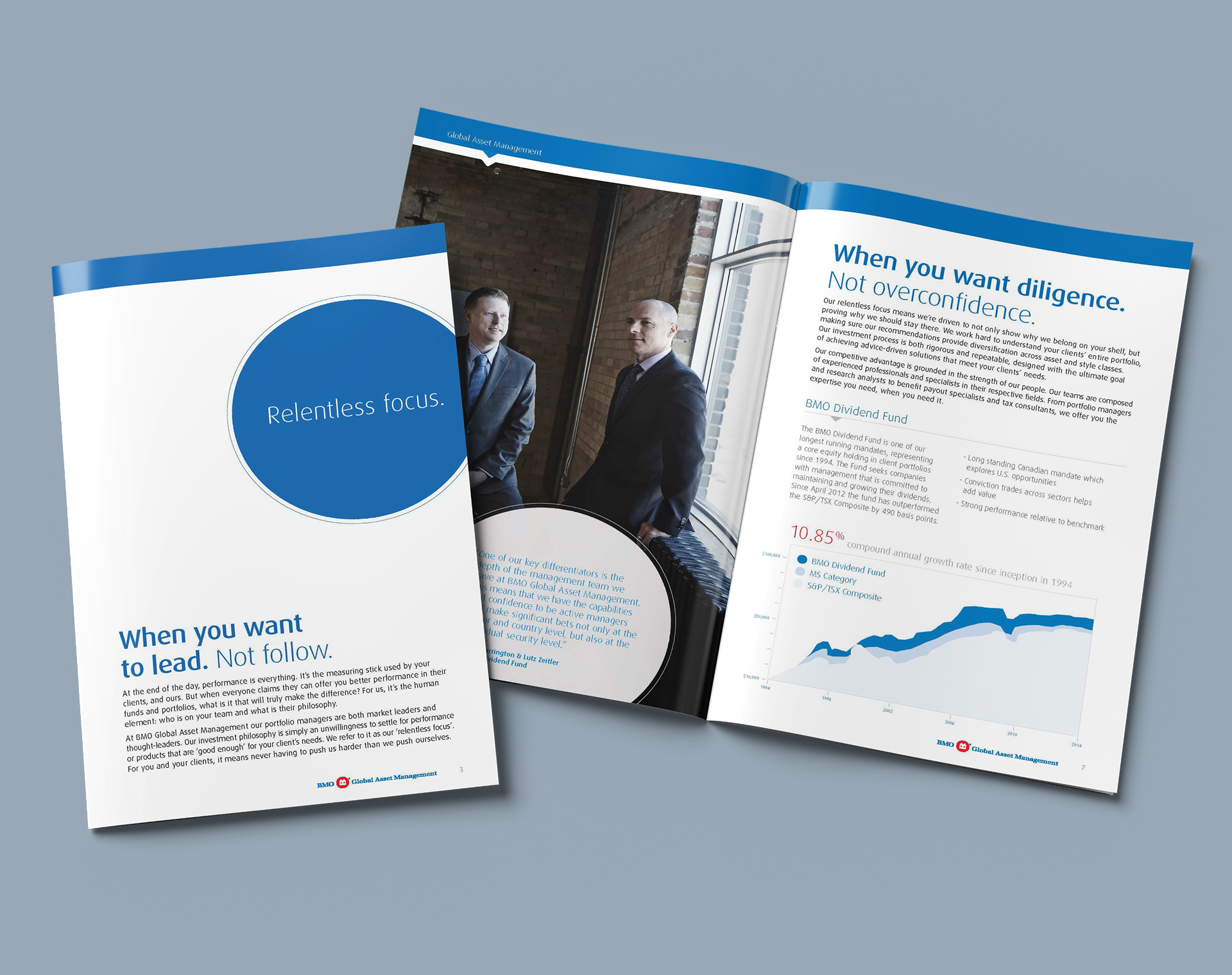
BMO
Challenge: How do we make BMO’s finance professionals appear approachable while maintaining their professional credibility?
Solution: We focused on humanizing the team through photography, visuals, and layouts that highlighted approachability, while keeping the professional brand tone intact. Visual storytelling balanced professionalism with relatability, showing them as guides rather than distant figures.
Impact: The project helped BMO connect with clients in a more engaging way, bridging the gap between traditional finance and real-world approachability.
CDIC
Challenge: How do we help people feel confident that their money is secure and ease their minds about financial safety?
Solution: We created visuals and messaging that emphasized security, stability, and trust, showing how CDIC protects deposits and gives peace of mind. Strategic use of color, typography, and imagery reinforced reliability and reassurance.
Impact: The project helped strengthen public confidence in CDIC, making financial security feel approachable and tangible for a wide audience.

The Keg
Challenge: How can we maintain the Keg brand while keeping it fresh and engaging on social media, targeting a specific generation?
Solution: We developed a social content calendar from scratch, creating photography, video, and animated GIF content that aligned with the brand but appealed to younger audiences. We also produced campaigns for seasonal events such as holidays, New Year, and anniversaries, ensuring content was timely, engaging, and shareable.
Impact: The campaigns successfully boosted engagement, maintained brand integrity, and connected with a new, younger audience on social platforms while reinforcing brand relevance during key seasonal events.

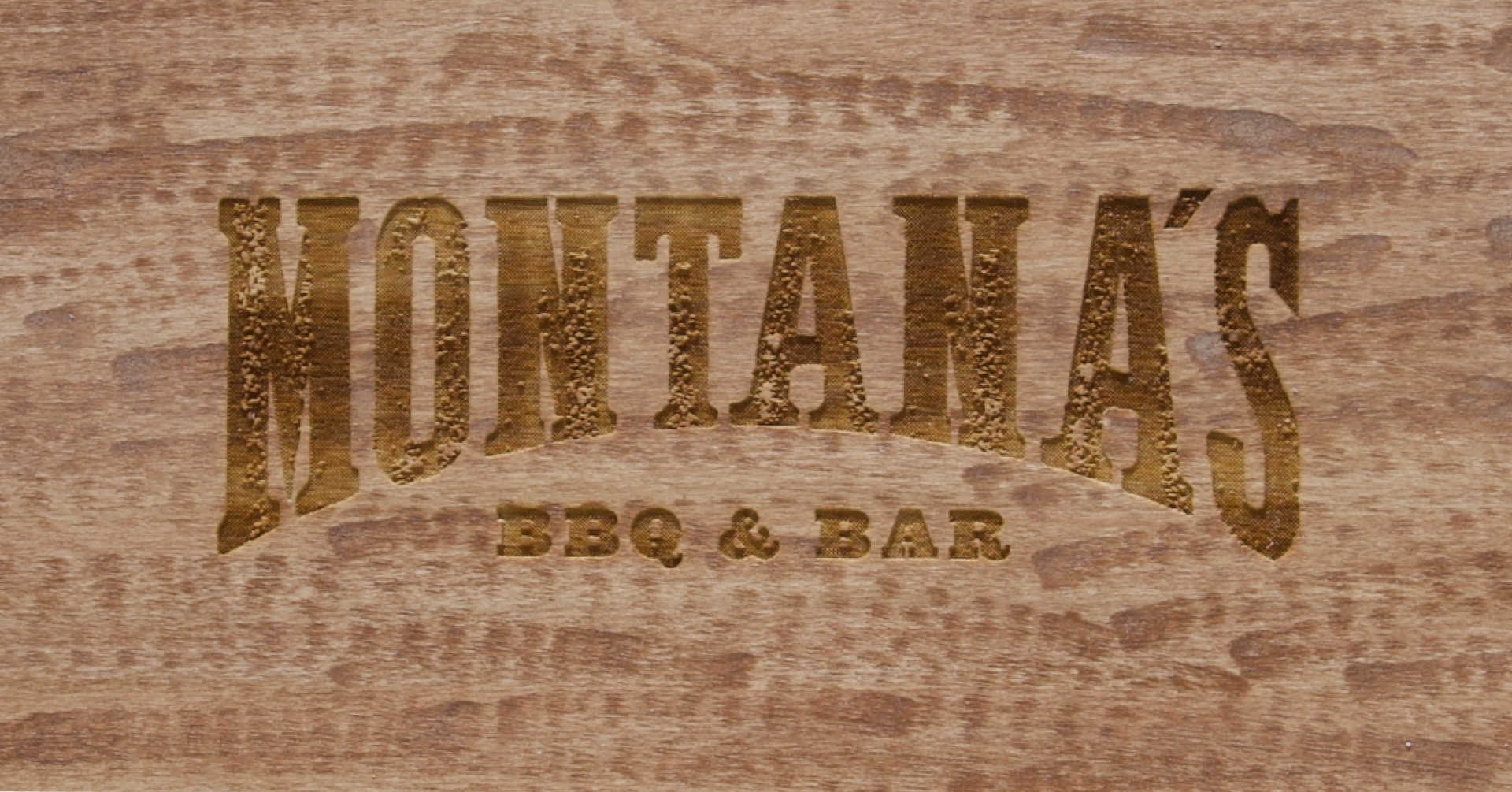
Montana's
Challenge: How do we refresh Montana’s brand while preserving its essence and heritage?
Solution: We conducted a full brand overhaul, developing a new brand voice, visual identity, and comprehensive brand guidelines. This included creating corporate collateral, menus, neon signage, and a new logo while attending photoshoots and managing social campaigns. All updates were carefully designed to honor the brand’s history while giving it a modern, cohesive look and feel.
Impact: The refreshed Montana brand successfully embraced a modern aesthetic without losing its core identity, resonating with existing audiences while attracting new customers and strengthening brand recognition.
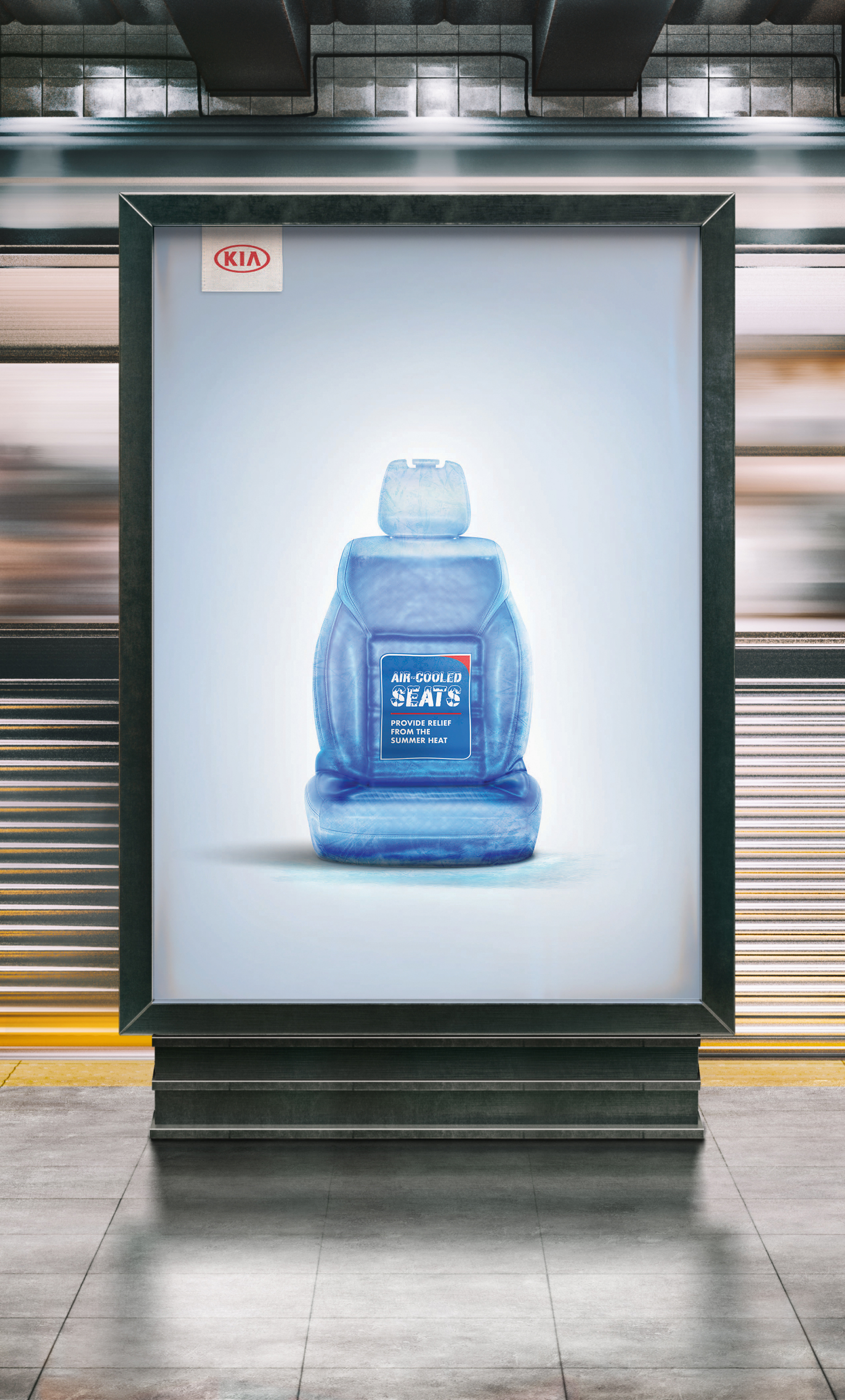
Kia
Challenge: How do we execute the same look and feel for an awards submission while staying true to the Creative Director’s vision?
Solution: I managed the project from start to finish, ensuring that every visual element, layout, and presentation detail aligned with the creative direction. This included reviewing assets, refining graphics, and coordinating with the team to maintain consistency across all submission materials.
Impact: The awards submission captured the creative vision flawlessly, maintaining brand consistency while presenting a polished, professional package that stood out to judges and stakeholders alike.
Harrowsmith
Challenge: How do we maintain the history and heritage of Harrowsmith while updating its visual identity for modern audiences?
Solution: I worked closely with the editor and publishers to shape each issue’s visual identity, translating the magazine’s legacy into layouts and imagery that respected its history while feeling fresh and contemporary. This included modernizing typography, integrating photography, and creating layouts that engaged both longtime readers and new audiences.
Impact: The refreshed design honored Harrowsmith’s heritage while attracting new readers, preserving the magazine’s reputation as a Canadian icon for sustainable living, gardening, DIY, and thoughtful lifestyle storytelling.
